digital earthDigital Earth is a tech website where users can purchase ecofriendly technology whilst benefiting the environment around them.
Role: Solo UX/UI Designer & Front-End Developer
Timeline: [Academic/Personal Project - 2024]
Tools: HTML, CSS, JavaScript, Bootstrap, Figma
Type: Full e-commerce website design and development
THE cHALLENGE...Design an e-commerce platform for sustainable electronics
that balances premium product presentation with environmental impact
messaging, making eco-conscious technology purchasing both aspirational
and accessible.
Empathize
Research Approach
Customer Interviews
To understand the eco-conscious business buyer, I conducted a mixed-methods research approach combining secondary research and direct user interviews. I began with competitive analysis, reviewing mainstream tech retailers like Apple, Dell, and Best Buy alongside sustainability-focused platforms like Fairphone and Back Market — examining how (or whether) these brands communicate durability, repairability, and environmental impact to business buyers.
I also explored research around B2B purchasing behavior and corporate sustainability, specifically looking at what motivates small business owners to factor environmental responsibility into operational decisions. A key tension I set out to understand was the balance between performance expectations and eco-conscious values — business buyers can't sacrifice reliability for sustainability.
Key research questions I set out to answer:
What does a small business owner actually need from a tech purchase beyond specs and price?
How do business buyers evaluate trustworthiness when shopping a brand they don't already know?
What role does environmental impact play in B2B tech purchasing decisions, and where does it fall in the priority hierarchy?
What would make bulk eco-tech purchasing feel low-risk and worthwhile?
Research Approach
I conducted interviews with participants who were small business owners and operations decision-makers who purchase tech for their teams and have some degree of environmental awareness. Sessions were 20–30 minutes and focused on purchasing habits, pain points with existing tech vendors, and reactions to sustainability-forward product framing.
Key themes that emerged:
Business buyers prioritize longevity and total cost of ownership over upfront price — a device that lasts 5+ years is far more valuable than a cheaper one that needs replacing in 2.
Participants felt genuine frustration with the upgrade cycle pushed by major tech brands, but didn't know where to find credible alternatives.
Sustainability claims felt untrustworthy unless backed by specific, verifiable data — certification badges, repairability scores, and sourcing transparency all helped.
Overall, several participants noted they'd be more likely to choose a sustainable option if they could frame it as a business value to their own clients — making the eco story marketable, not just personal.
Customer Interviews
Define
Persona Development
Problem Statements
Persona Development
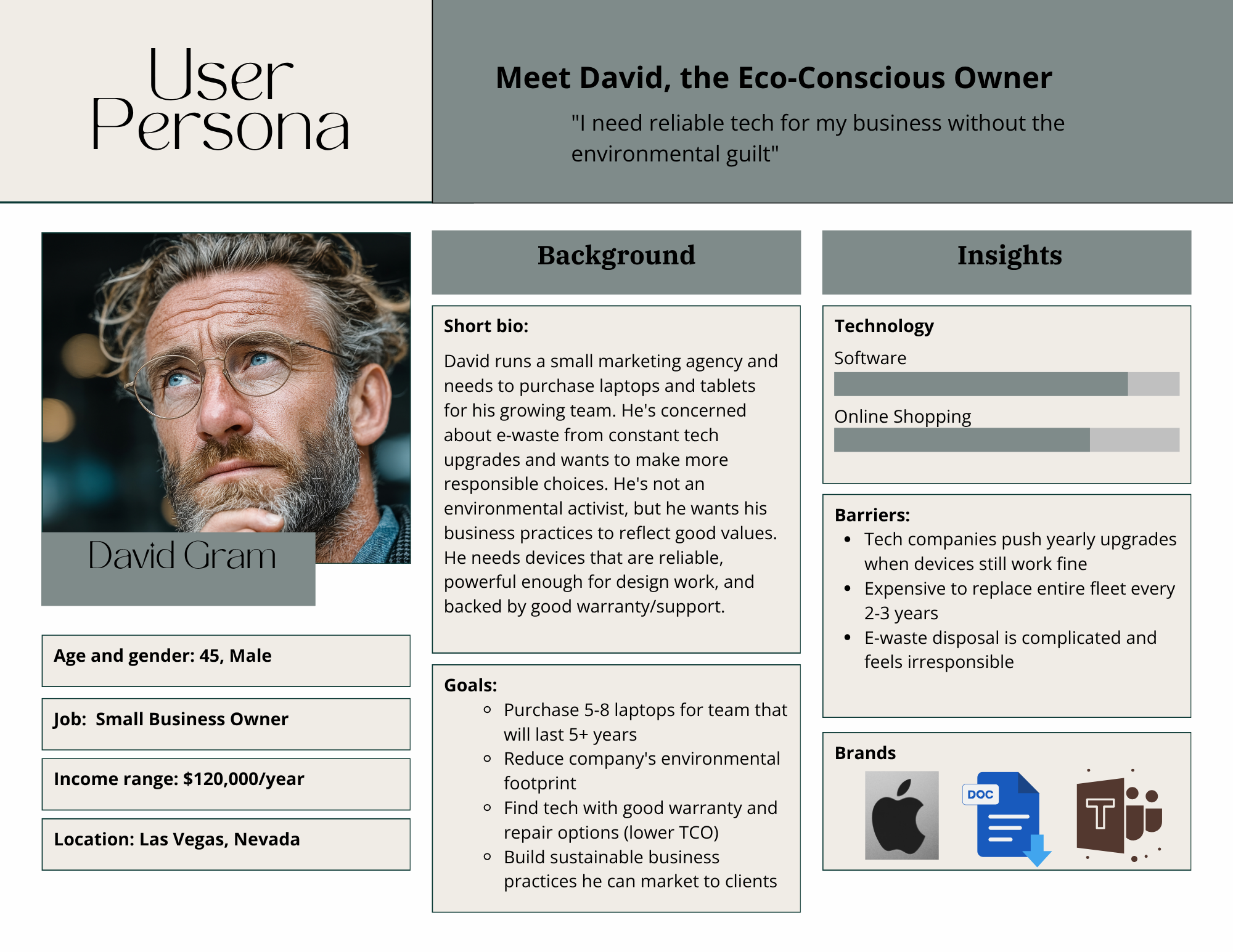
Through my research interviews and synthesis, I created a persona at the center of the Digital Earth experience.
Meet David Gram — "The Eco-Conscious Owner: "I need reliable tech for my business without the environmental guilt."
Age: 45 | Gender: Male | Location: Las Vegas, Nevada
Occupation: Small Business Owner | Income: $120,000/year
David runs a small marketing agency and is in the market for laptops and tablets for his growing team. He's not an environmental activist — but he cares about his company's values and wants his purchasing decisions to reflect them. His biggest frustration is that tech companies push yearly upgrade cycles even when devices still work perfectly fine, making responsible disposal complicated and costly. He uses tools like Apple, Google Docs, and Microsoft Teams daily and is comfortable shopping online, but needs to trust the brand before committing to a bulk purchase.
He’s aiming to benefit his business as well as reduce his eco-footprint by lowering the frequency of buying technology, find tech with solid warranty and repair options to lower total cost of ownership, and curate sustainable business practices he can market to his own clients.
He’s currently frustrated with the pressure Tech companies face with constant upgrades even when devices are still functional. He feels it’s expensive and wasteful: “E-waste disposal feels complicated and irresponsible with no clear solution”.
With David's goals and frustrations in mind, I defined the following core problem statements to anchor the design process:
How Might We:
How might we help business buyers like David evaluate long-term product value alongside environmental impact in a single, trustworthy experience?
How might we reduce the perceived risk of switching to an eco-conscious tech brand for bulk business purchases?
Problem Statements
Ideate
Brainstorming
Storyboarding
User Flows
With David's problem statements in mind, I moved into divergent thinking using a combination of rapid "Crazy 8s" sketching and mind mapping. I explored a wide range of ideas centered on what would make a business buyer like David feel confident, informed, and proud of his purchase:
A "Built to Last" product badge highlighting expected device lifespan and repairability score
A bulk purchase calculator that estimates total cost of ownership and environmental savings over 5 years
A business buyer landing page tailored to team and fleet purchasing with quantity discounts surfaced early
A sustainability certification module on product pages breaking down exactly what makes each device eco-responsible
A "Share Your Impact" feature allowing businesses to generate a summary of their environmental contribution — something David could use in client-facing marketing
An e-waste trade-in program integration, addressing David's frustration around responsible device disposal
After narrowing by feasibility and impact, I focused on: premium product presentation, transparent longevity and impact data at the product level, and a streamlined experience for business-scale purchasing.
Brainstorming
I storyboarded David's core journey:
He's frustrated after getting yet another upgrade push from his current vendor → searches for alternatives and finds Digital Earth → lands on the homepage and immediately sees a mission statement that speaks to business responsibility, not just personal values → browses the business buyer section → finds a laptop with a clear repairability score and 5-year durability rating → reads the environmental impact breakdown and feels confident in the decision → completes a bulk order and receives a summary of his team's collective environmental contribution.
This storyboard highlighted two critical emotional moments — the homepage first impression (does this brand get what I need?) and the product detail page (can I actually trust this?). Both became priority design areas.
Storyboarding
User Flow
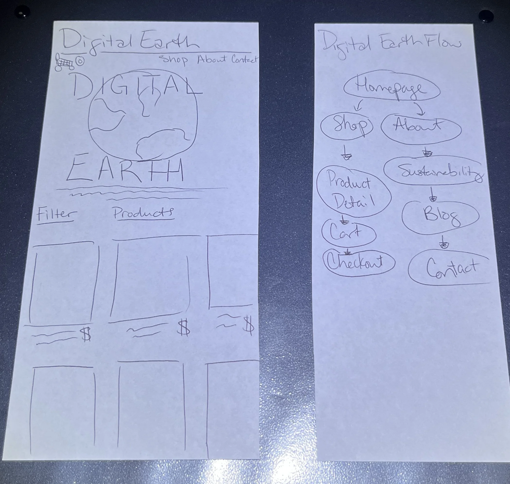
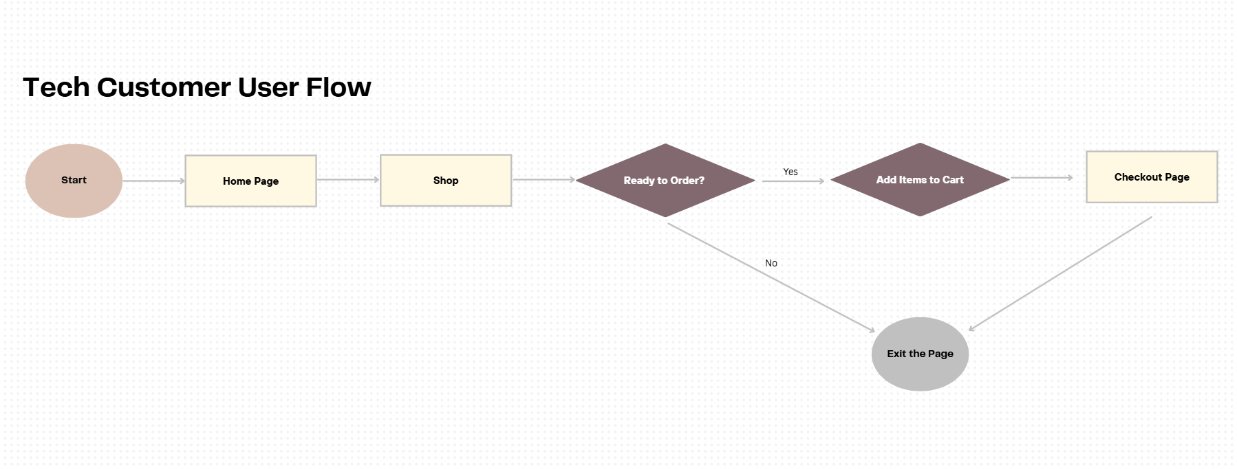
I mapped David's primary user flow from: homepage → business buyer category → product detail → bulk cart → checkout, identifying where business-specific needs diverged from a standard consumer journey. A secondary flow covered the filter and search experience for a buyer who arrives knowing the product type but needing to compare options by durability and certification. These flows shaped the site architecture, and informed which pages needed the most design investment.
Prototype
Low Fidelity
Branding & UI Kit
Final Design
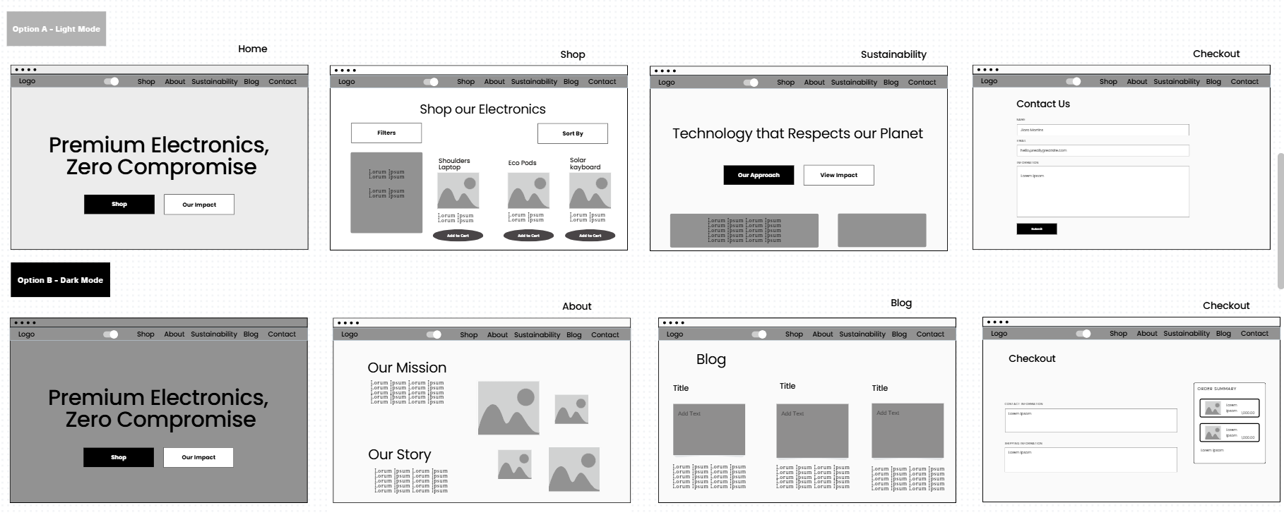
I began with hand-sketched wireframes to quickly establish layout logic without getting caught up in visual details. From there, I translated the sketches into digital low-fidelity wireframes in Figma, mapping out the homepage, product listing page, cart, and checkout flow. The wireframes prioritized hierarchy — leading with impact messaging, followed by product imagery, specs, and trust signals.
Low Fidelity
Branding & UI Kit
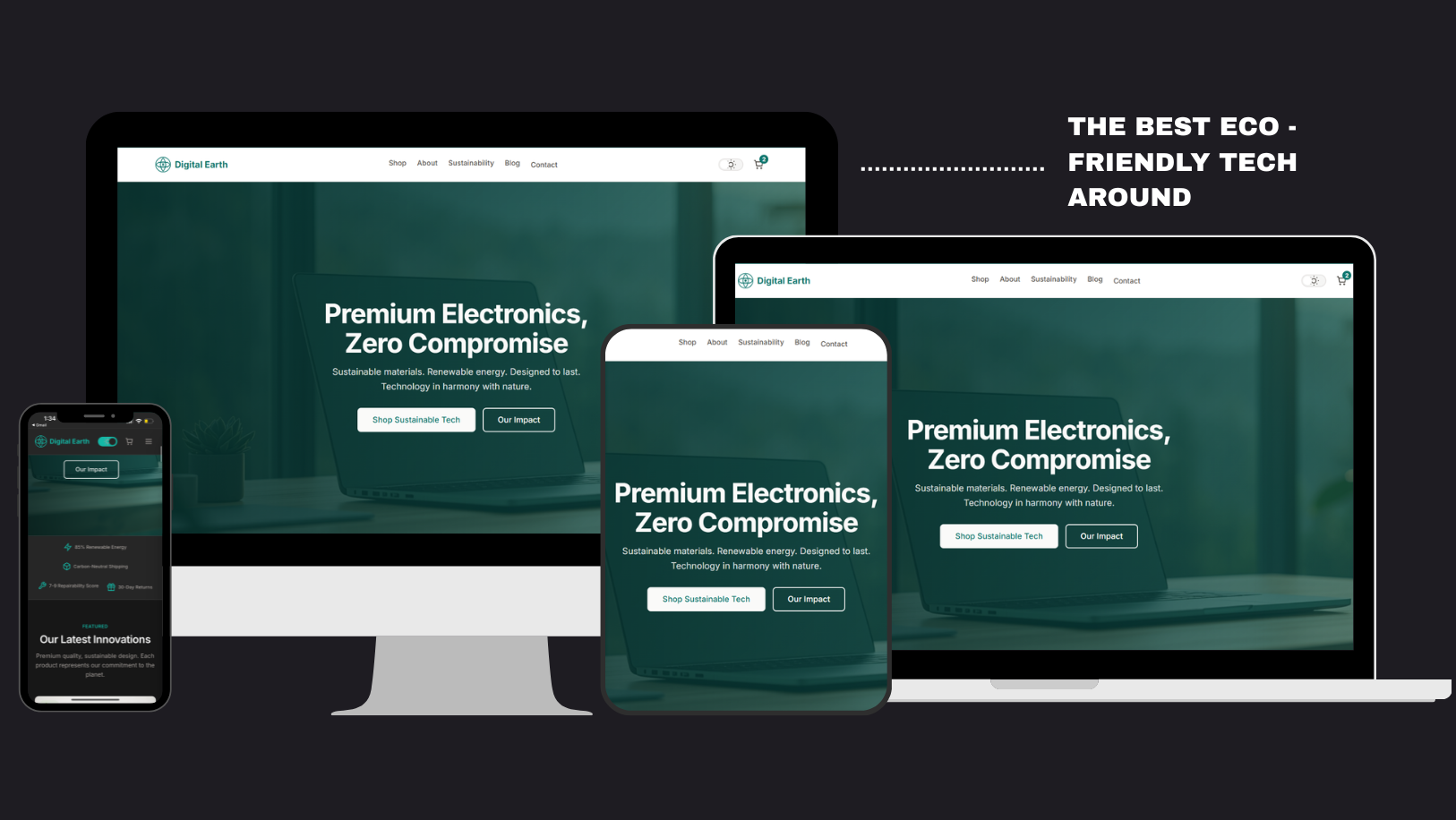
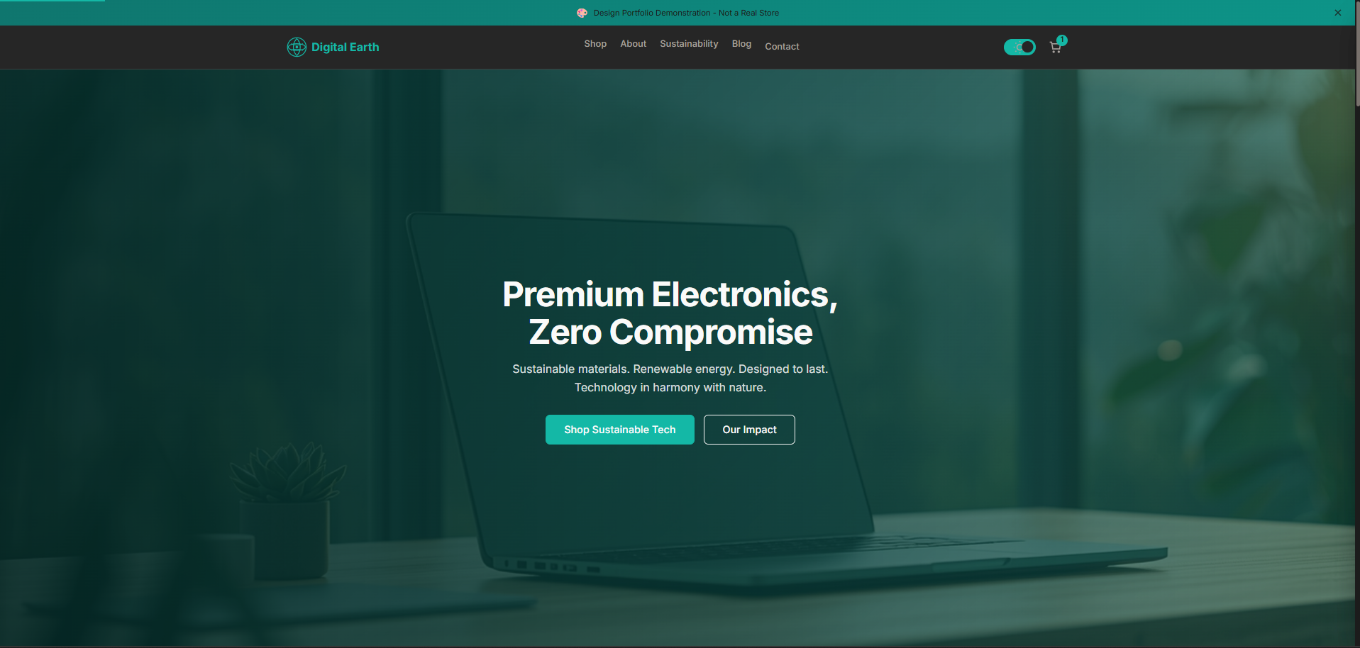
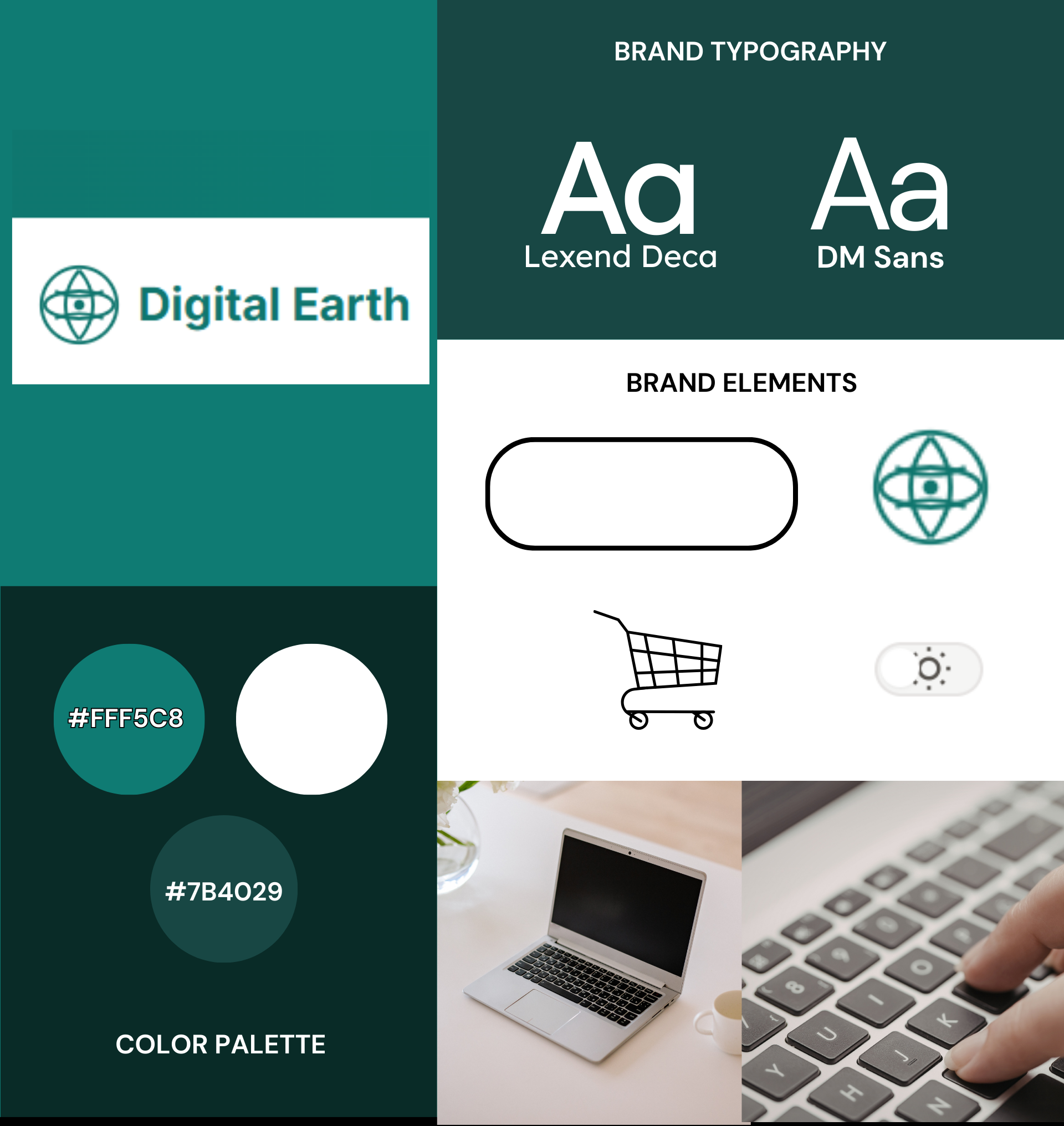
Digital Earth's visual identity was built around the idea of sustainable premium — the brand needed to feel clean, credible, and aspirational without sacrificing warmth.
Color Palette: Deep forest green as the primary brand color, paired with white and soft earth tones to evoke nature without feeling overly "crunchy."
Typography: A modern sans-serif for headlines (clean, tech-forward), paired with a slightly humanist body font for approachability.
Components: Including buttons, product cards, navigation, badges, form fields, and modal styles — all built for consistency and reusability across the site.
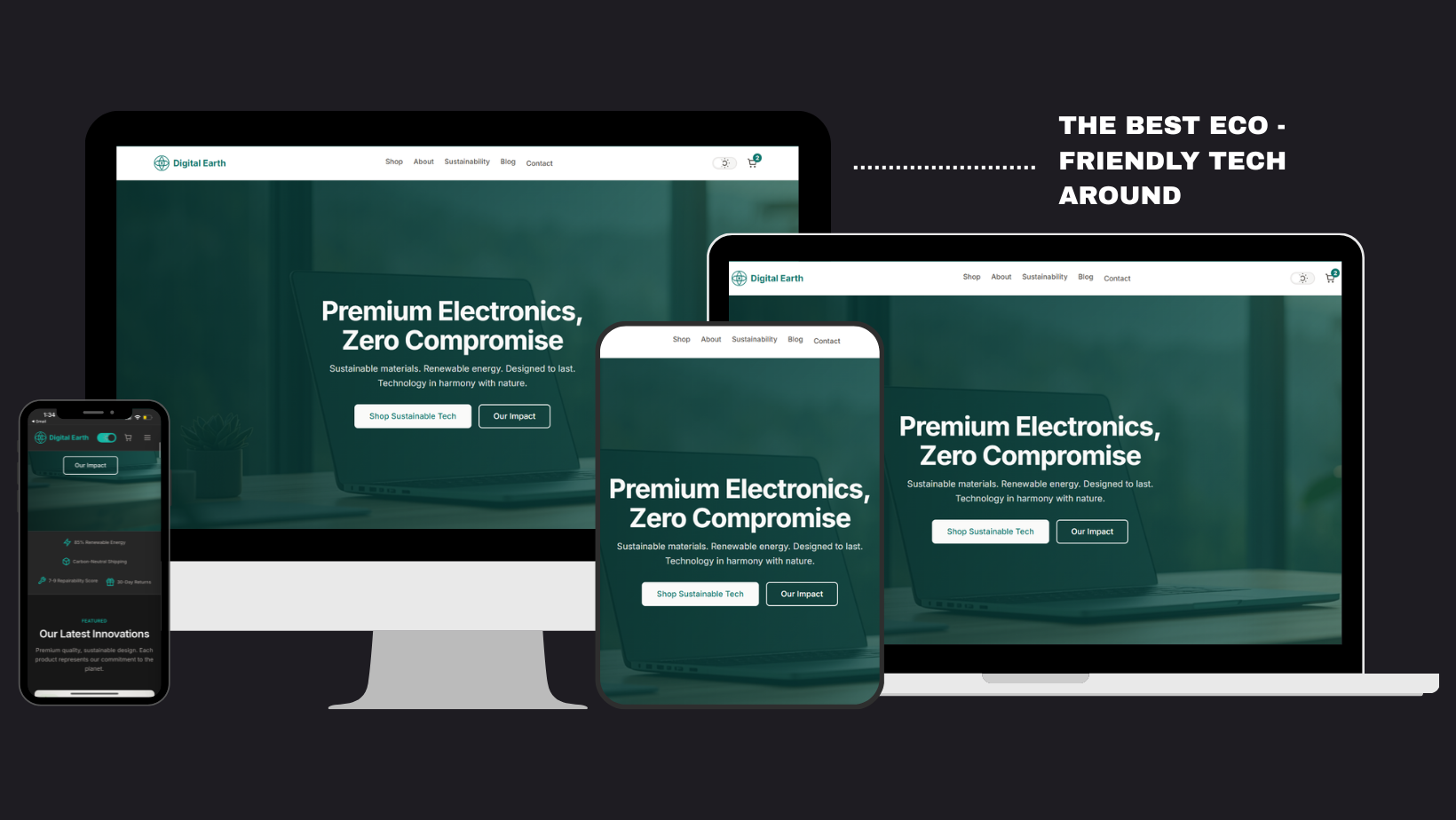
Final Design
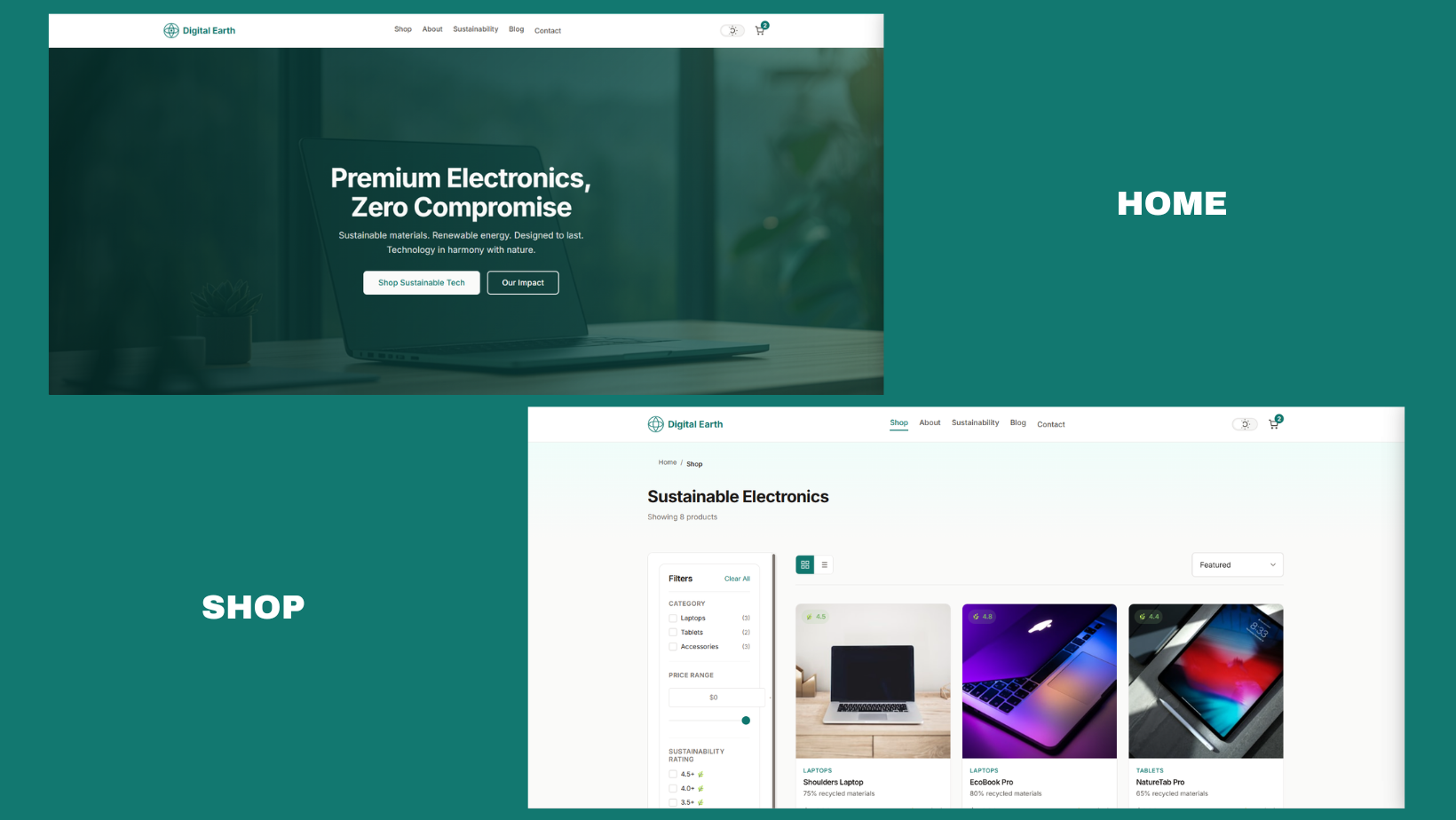
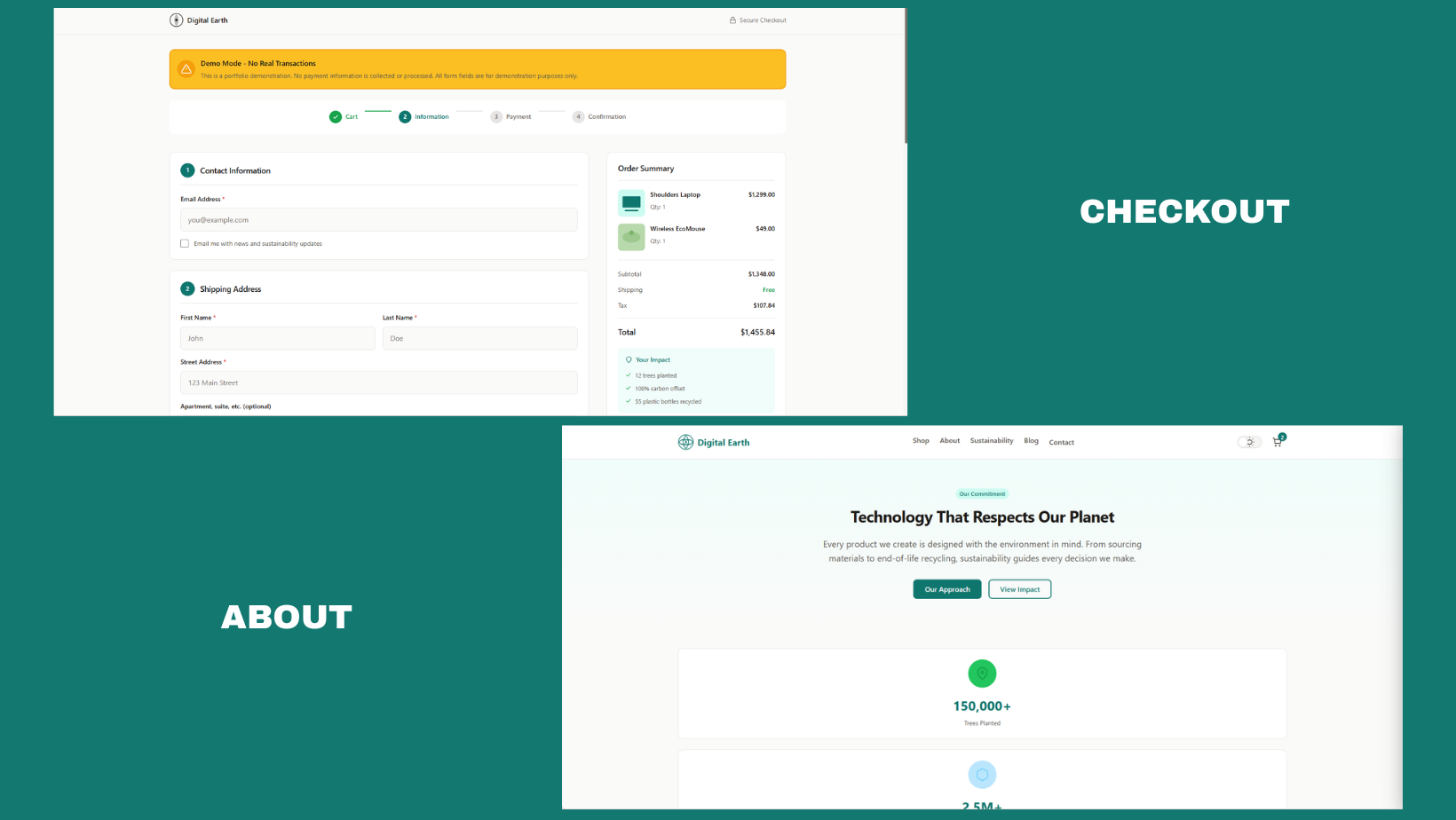
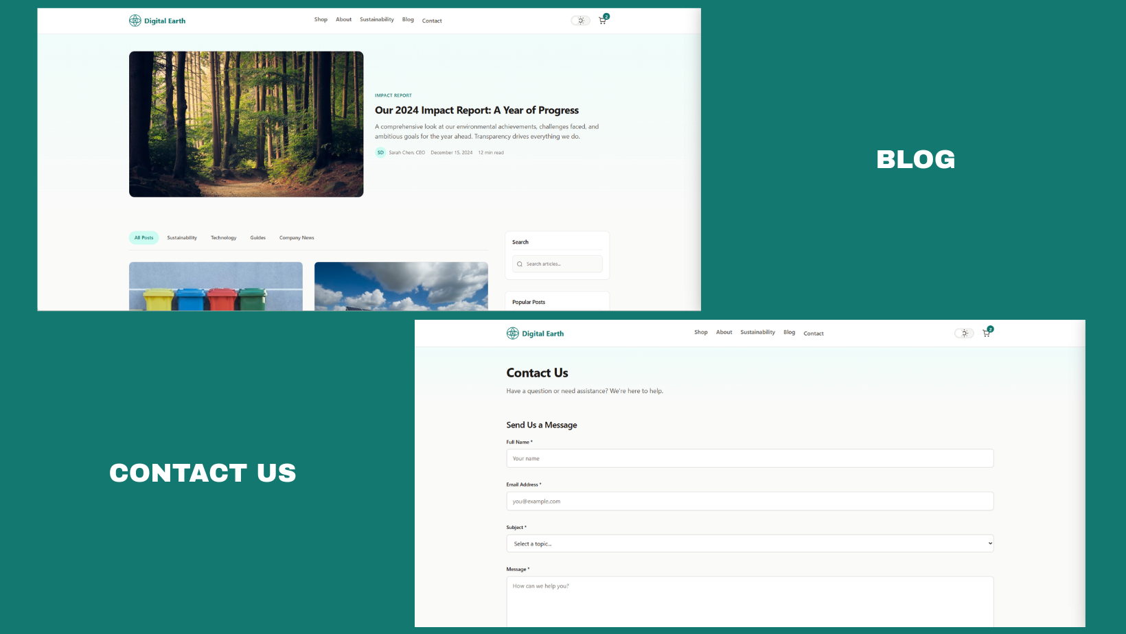
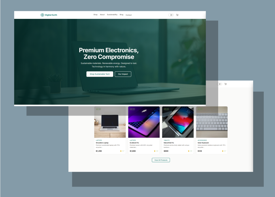
The final high-fidelity designs brought together the branding system and wireframe architecture into a fully realized e-commerce experience. The homepage leads with a bold environmental mission statement, followed by featured product categories and an impact statistics section. Product pages surface eco-credentials prominently — material sourcing, energy efficiency ratings, and repairability scores — without burying the traditional product specs users also expect. The checkout flow was kept minimal and confidence-building, ending with a personalized "Your Impact" summary screen. I also included a Sustainability, About and Blog page to further establish creditability and trust with any potential customers.
The final design was developed into a fully functional website.
Test
Feedback
Priority Revisions
Reflections
Feedback
I conducted usability testing with 4 participants using the high-fidelity prototype in Figma. Participants were asked to complete two tasks: (1) find and purchase a specific product using the filter system, and (2) locate information about a product's environmental impact before adding it to their cart.
Key feedback themes:
Users responded positively to the homepage's mission-forward design — several noted it immediately communicated what made Digital Earth different.
The eco-filter navigation was well-received but two users wanted more granular filter options (e.g., filter by specific certification type).
The "Impact Score" badge on product cards was noticed and appreciated, but users wanted to click through to learn more — the badge needed a tooltip or expandable explanation.
One user found the checkout's "Your Impact" summary screen to be a standout, memorable moment that would make them more likely to return.
Priority Revisions
Based on test findings, I prioritized the following revisions before finalizing:
Refined mobile responsiveness — several elements needed tighter spacing and tap target adjustments on smaller screen sizes.
Improved CTA contrast — increased button color contrast on the product detail page to meet WCAG AA accessibility standards.
Reflections
The Digital Earth project pushed me to think critically about the gap between good intentions and good design — specifically, how to communicate sustainability in a way that feels genuine rather than performative. One of the most valuable lessons was learning that users don't want to be lectured about the environment while they shop; they want to feel empowered and informed without friction.
If I were to extend this project, I'd explore deeper personalization — a "My Impact Dashboard" where returning users can see the cumulative environmental benefit of their purchase history over time. I'd also invest in A/B testing the homepage hero to measure how different sustainability-forward vs. product-forward messaging affects conversion.
This case study reinforced my belief that purposeful design can make ethical consumption feel effortless — and that's exactly the kind of work I want to continue doing.